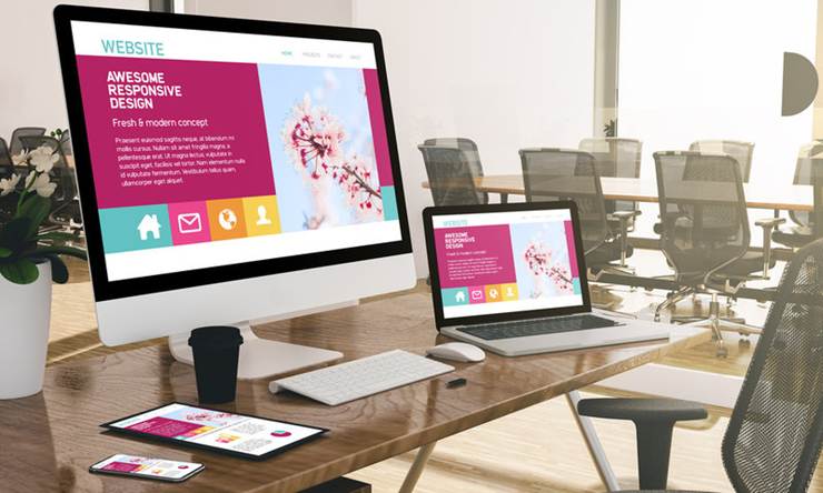
Every brand is speaking long before it says a word. The moment a user lands on a website or glances at a logo, an impression is formed – not through marketing copy, but through design. Fonts, colors, layout, motion, even the silence between elements – each one carries a message. Design isn’t just how something looks; it’s how a brand behaves. It reflects how much thought, care, and consistency exist behind the scenes.
Pro Financial Design’s Cullen Fischel is someone who blends design thinking with business strategy and perfectly recognizes this silent language. His background in financial planning and marketing gives him a rare perspective: that design is not simply decoration; it’s communication. Every visual choice influences how a brand is perceived – structured or scattered, modern or dated, confident or uncertain. The most effective designs make that communication intentional, not accidental.
The Power of the First Impression
Until you know it sets the tone for a whole engagement, the typeface used on a website may seem like a small decision. Sans-serif fonts imply modernism and simplicity, while serif fonts provide a sense of tradition and dependability. More quickly than a typo, a badly chosen font can shatter the appearance of credibility. The same is true of color choices: red denotes vitality, green harmony, and blue trust. They can cause more confusion than they can help when coupled carelessly.
In that sense, design becomes the nonverbal handshake of a brand. Before users read a single sentence, they already sense who they’re dealing with. Design can whisper sophistication, radiate warmth, or command authority – all without a word of copy.

Consistency Equals Integrity
A brand that presents consistency in design reflects discipline in its operations. Clean lines, structured grids, and unified visuals suggest organization and intention. Mismatched styles or inconsistent layouts, on the other hand, create doubt. When visual language shifts from page to page, it tells users the brand doesn’t have a firm grasp of its own identity.
By paying close attention to details, strong brands preserve their visual integrity in the same manner that they preserve their commercial integrity. Subconscious trust is increased by this constancy. Users feel anchored in dependability when they see the same tone and reasoning throughout a brand’s website, social media accounts, and collateral. In this sense, design turns into a stand-in for credibility.
The Dialogue Between Aesthetics and Function
The two functions of design are to serve and to attract. While the second makes sure the user stays, the first invites them in. The best designs balance practicality and attractiveness, with each element uncompromisingly supporting the other. Easy-to-use navigation conveys consideration for the user’s time. Careful spacing conveys confidence and serenity. Both a highly functional layout that lacks soul and an aesthetically beautiful interface that performs poorly fall short.
True design leadership lies in knowing that beauty and usability are not opposites but partners. When function is treated as an art form and aesthetics as a form of logic, the result is seamless communication – a site or brand that feels natural, as if it could not exist any other way.
How Design Expresses Brand Character
Design choices are cultural statements. A brand’s design tells users what it value – precision or playfulness, accessibility or exclusivity. A minimalist design conveys restraint and focus, while a layered, tactile aesthetic reflects richness and emotion. Neither is right or wrong; the question is alignment. Does the design reflect the truth of the brand?
This is exactly where the strategic design earns its value. Every decision, be it the line thickness or even the hover behavior, it all adds up to a perception. A sleek financial firm’s website with glowing gradients and cartoonish icons sends mixed messages. A wellness brand using cold, angular imagery feels dissonant. The most successful firms create their designs with loyalty – to their values and identity – rather than for trends.
When Design Reflects Leadership
A leadership mindset that prioritizes coherence is the foundation of any well-organized brand presence. Design selections match business priorities. A business is choosing long-term trust over temporary praise when it prioritizes clarity over clutter. It communicates that it views its audience as individuals rather than as traffic when it makes investments in accessible design, font, and spacing.
Good design costs time because it demands self-awareness – it forces a brand to ask, “Who are we really?” That introspection shapes both how the company appears and how it behaves. Design, in that sense, becomes a mirror for brand character.
The Takeaway: Form as Integrity
Design demonstrates whether a brand fulfills its promises. Even the simplest details, like button layout, color scheme, and font choice, can reveal a lot about a brand’s accuracy and goals. Effective design eliminates the necessity for an explanation of its function. People just sense it.
In a market filled with noise, good design stands out not because it’s loud but because it’s clear. It doesn’t demand attention – it earns it. From font choice to site structure, from interface flow to functional detail, design tells the truth about a brand’s integrity.
And that truth, more than any campaign or slogan, is what builds lasting trust.
